The saying “a picture is worth a thousand words” has a lot of truth to it. And in the same manner, “a picture can be worth a thousand logs.” But how do you view the interactions of a thousand, a million or a billion logs visually?
This is where Security Visualization (or SecViz) comes in, the ability to try and spot patterns and trends on vast amounts of data. While SecViz is a concept and methodology, how you produce the picture does generally require some technology. I mean, there’s nothing to stop you from getting your creative juices flowing and dusting of the oil paints, but fortunately for us, there are a multitude of open-source programs available to do just this—such as SecViz’s DAVIX distribution.
However, while these are the tools we can use, they still require meaningful data in order to be best used. That’s where LogRhythm’s structured metadata comes into play. In the examples below, I’ve used the Gephi* — an interactive visualization and exploration platform for all kinds of networks and complex systems, dynamic and hierarchical graphs, to create LogRhythm-powered SecViz (and if nothing else, they make a great wallpaper!)
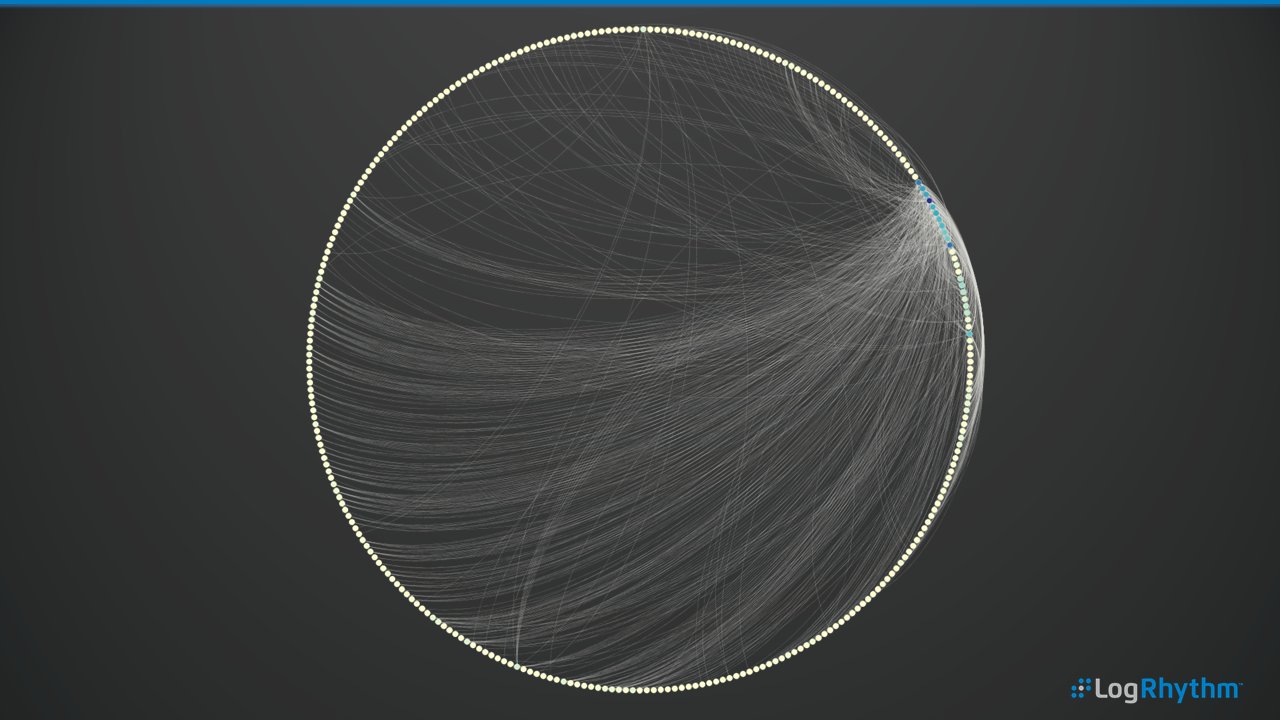
A Day’s Worth of Network Activity
In this example, we can see a day’s worth of network activity, such as LogRhythm Classification as Network Traffic, Network Allow and Network Deny. There are a wide array of devices from which LogRhythm can normalize the log data into these classifications, but by and large, it’s your network and host-based firewalls that can provide this information. These nodes on the circle are grouped by network segment. In this case, the different colored nodes represent different network segments with the lines showing the node connections.
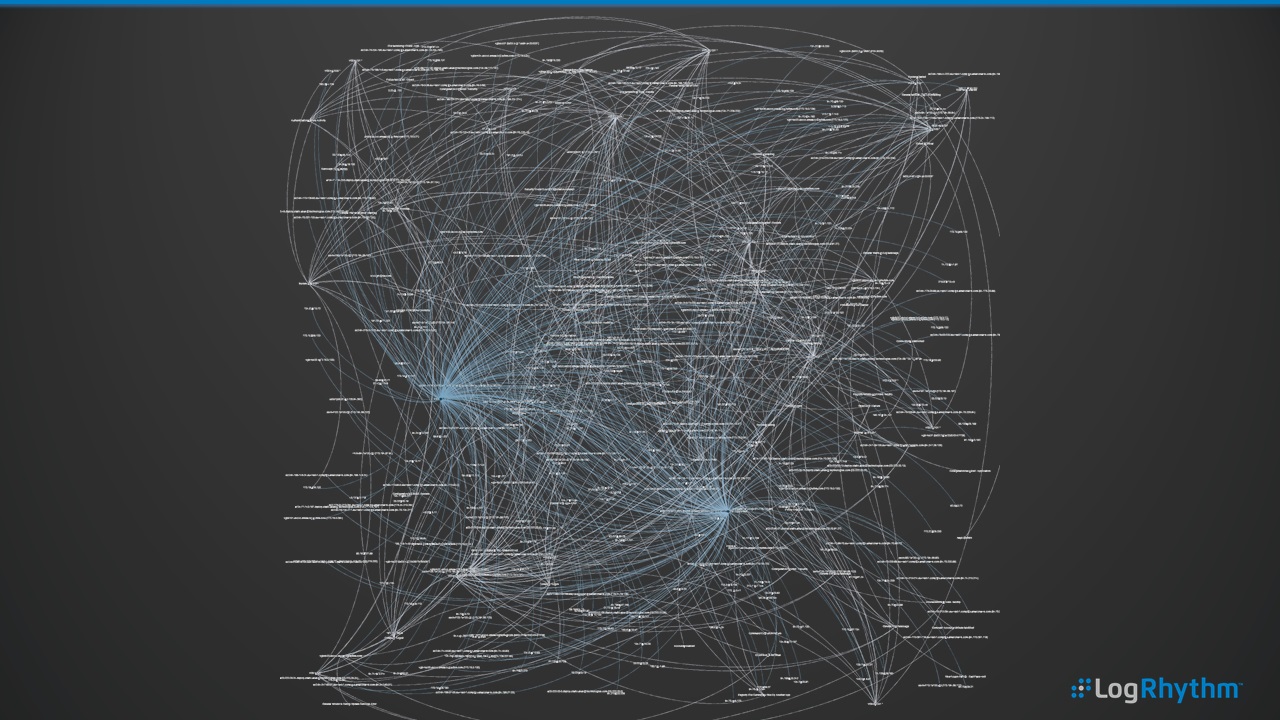
As a comparison, here’s a similar subset of data, but using a different visualization layout. This is a challenge around SecViz. To avoid occlusion where we potentially have too much data for this specific layout, we can’t necessarily draw value from what we’re seeing.
However, in this example, there are certain nodes that jump out as having a large number of connections. Therefore, it’s possible to create animated versions of network activity—to literally press play and have the historical network devices conversations and connections.
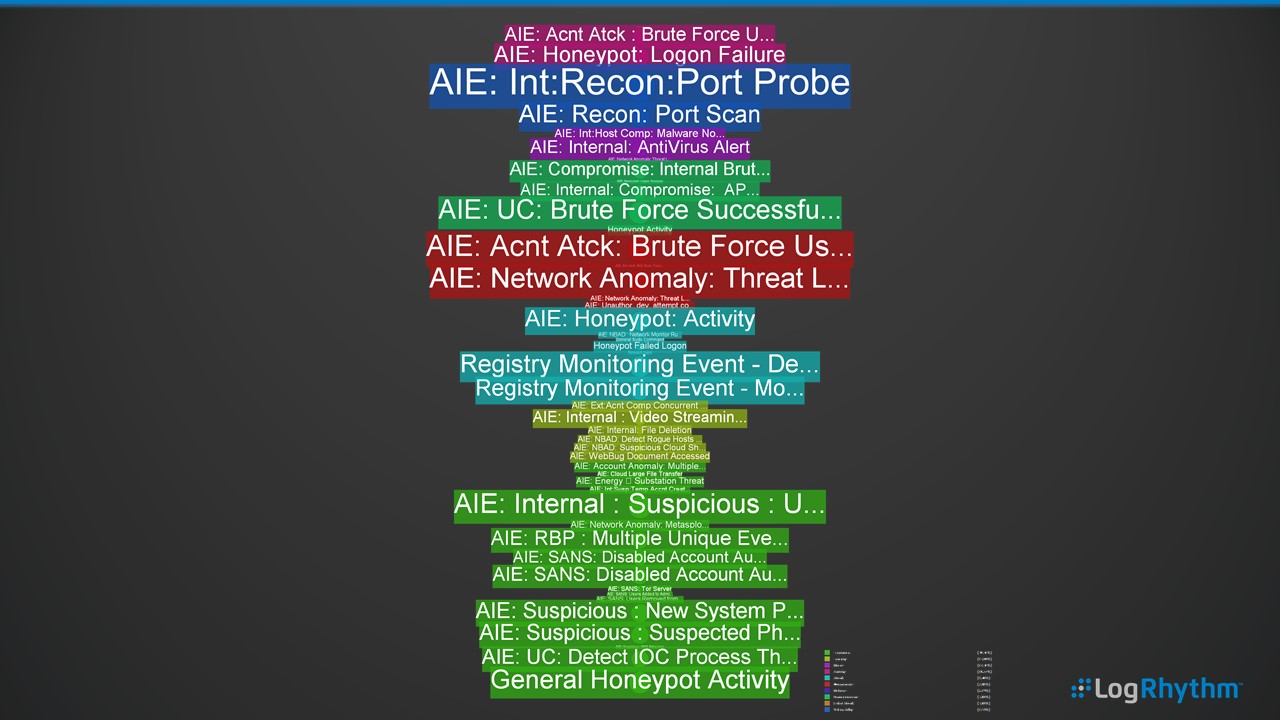
Alarm Cloud Tag
Here, we can see several weeks’ worth of LogRhythm correlation alarms being displayed by event type, represented through the color of the tag (e.g., audit, network, security, etc.) and the frequency of the alarm represented by size.
Immediately, our network-related activities such as the Port Probes and Brute Force attacks jump out as regular activities. We can use this method to plot the alarm data for long-term trending and quickly compare on a month or week-by-week basis to visually see the threats and risks to the enterprise.
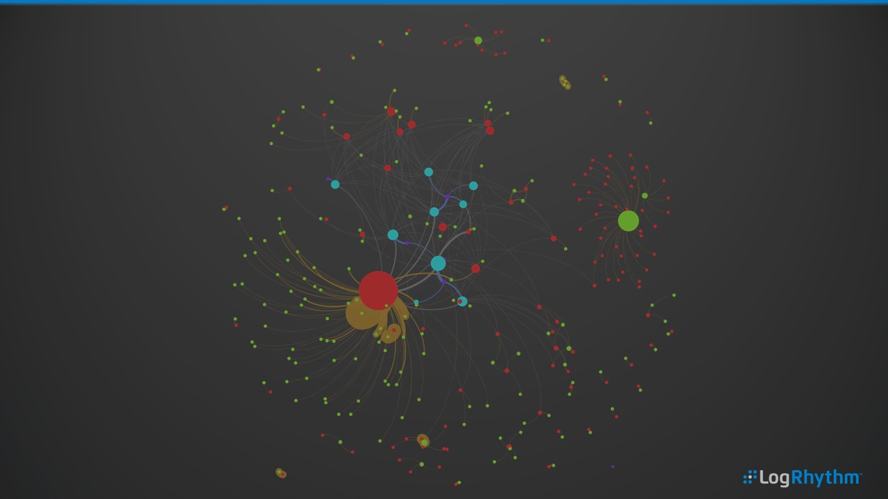
Users, The Software They’re Running and From Where
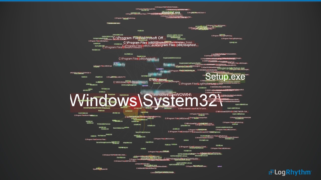
In this example, we’re plotting the user (blue), the process path (red) and the process (green). For example, the user Bob running the program outlook.exe from the path c:\program files\mirosoft office. This view can quickly show the most frequent user activity on a host, a user’s activity across many hosts or software usage within an enterprise. This can provide a great high-level overview of day-to-day usage, as well as helping to explore anomalous software activities such as errant user activity or processes running in an abnormal location.
And, in case you were looking at the previous picture and thinking, hang on a sec—that’s not much use. What process or paths?! Well, you’re right. Here’s the same graphic with appropriate labels overlaid.
Entire Enterprise Log Activity by Classification
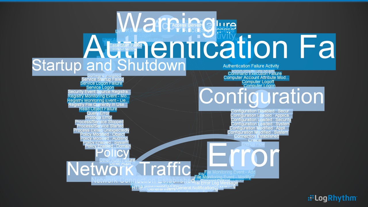
In this circular layout, we’re displaying a week’s worth of log and audit activity broken down by LogRhythm Classification and the child Common Events (e.g., Classification of Authentication Failure) and Common Events such as User Logon Failure or Service Login Failure. This is another example where we’re visualizing hundreds of millions of logs across a week in a single picture—a great way to respond if you’re ever asked the question “What’s happening on our network?”
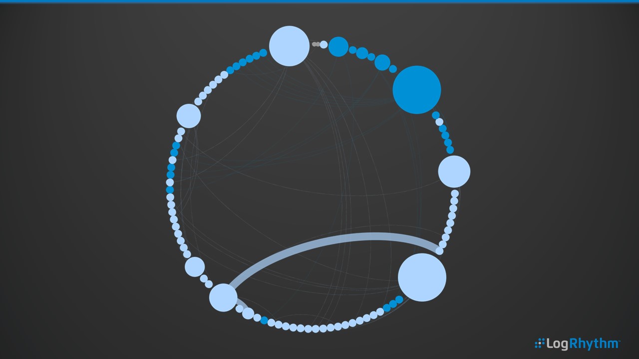
And, as in the above example, we have a before and after example that includes labels using color and sizing for context.
And Finally….
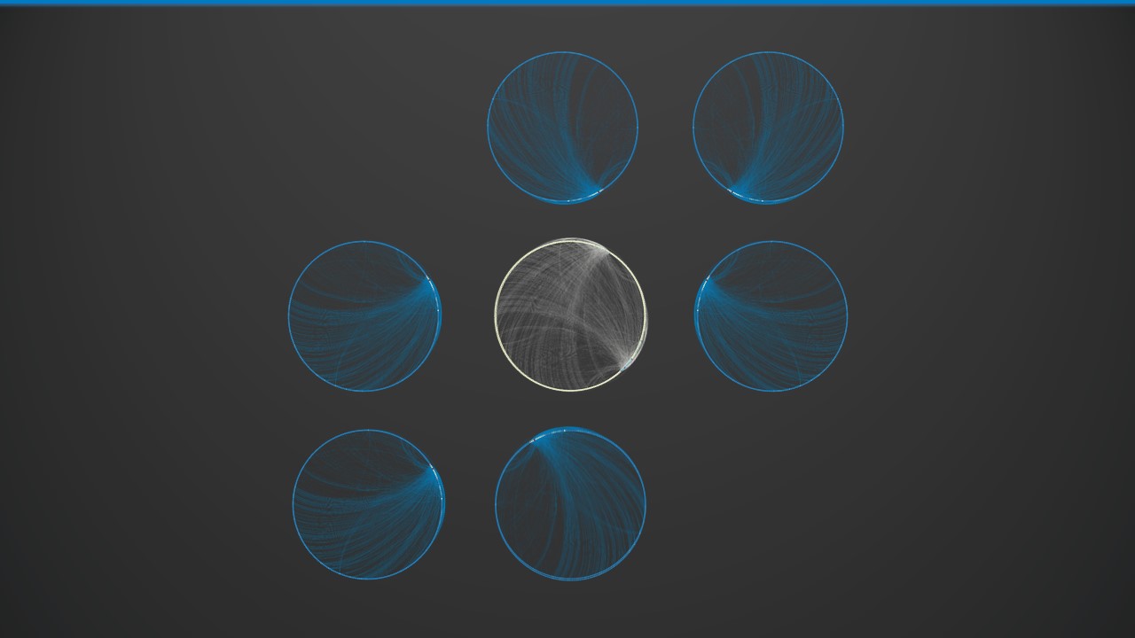
Did I mention that SecViz can make great wallpaper?
If you’d like to see an example of this in action, there’s a brief video available here.
But How Did You Get this Data Out of LogRhythm?
Well, that’s a good question. There are multiple ways to export data from the LogRhythm Security Intelligence Platform. One is to simply export from our Web UI to CSV. Two is by running a scheduled report and saving it as CSV/XLS. The third is to use our API (my personal favorite).
Please note: Gephi is not a LogRhythm-developed or supported application. However, it is rather awesome. While we can’t directly support you on your SecViz endeavors, we can provide some great metadata and always try our best to help where and when we can!